
Stop Building Dashboards Nobody Uses: How to Create Portfolio Visibility That Actually Drives Decisions
I was sitting in a steering committee meeting last year when the CIO turned to the PMO director and said, "I have 47 slides of project status and I still don't know if we're going to hit our Q3 targets." The room went quiet. It was uncomfortable. And it was completely fair.
Here's the thing most PMO leaders won't admit: we've gotten really good at building dashboards that nobody actually uses to make decisions. We track RAG statuses, milestone percentages, and budget burn rates. We produce beautiful reports that executives skim for thirty seconds before asking the same question they always ask: "So are we on track or not?"
If that scenario sounds familiar, you're not alone. And it's not a technology problem. It's a framing problem.
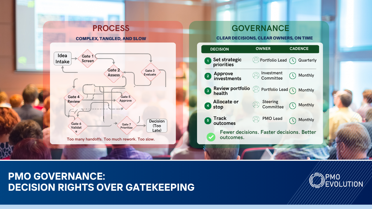
The Dashboard Trap
Most PMOs fall into what I call the Dashboard Trap. They invest weeks configuring reports, automating status updates, and color-coding everything in sight. The output looks professional. The problem is that it answers questions nobody is asking.
Executives don't need to know that Project Alpha is 73% complete. They need to know whether the portfolio is positioned to deliver the outcomes the organization committed to this year. That's a fundamentally different question, and it requires a fundamentally different approach to visibility.
When I work with PMO leaders through the Vision2Value Framework, we start at the Portfolio Definition layer for a reason. Before you can build meaningful visibility, you need absolute clarity on what the portfolio is supposed to achieve. Not a list of projects. A clear line of sight from strategic objectives to the initiatives that are supposed to deliver them.
Three Shifts That Change Everything
Over the past two decades, I've watched PMOs transform their portfolio reporting from noise to signal. The ones that succeed consistently make three shifts.
First, they shift from activity reporting to outcome reporting.
Instead of showing how many tasks are complete, they show progress toward the business outcomes each initiative was funded to deliver. This is where benefits realization becomes critical, and it's the top layer of the Vision2Value Framework for a reason. If you can't articulate the intended benefit, you have no business tracking the project.
Second, they build decision-ready views, not information dumps.
A good portfolio dashboard should answer three questions in under 60 seconds: Where are we at risk? Where do we need to make trade-offs? What needs executive attention right now? Everything else is noise. When I set up portfolio views in Smartsheet for my clients, I build them around these three questions. Control Center lets you standardize project structures across the portfolio, and the reporting layer pulls real-time data into views that are designed for decision-making, not decoration.
Third, they connect capacity to commitments.
This is the one that catches most PMOs off guard. You can have perfect status reporting and still fail because nobody is watching whether the organization actually has the capacity to deliver what it's promised. Resource Management in Smartsheet gives you the ability to overlay demand against available capacity at the portfolio level. When an executive asks "can we take on this new initiative," you should be able to answer that question with data, not gut feel.
Making It Practical
Let me give you a real scenario. A client we worked with last year had 83 active projects across four business units. Their PMO was producing a 30-page monthly report. The executive team had stopped reading it. They'd just show up to the monthly review and ask the PMO director to "give us the highlights."
We rebuilt their portfolio visibility from scratch. We started by mapping every project back to one of five strategic objectives. If a project couldn't clearly tie to an objective, it got flagged for review. That exercise alone resulted in 11 projects being paused or killed, freeing up roughly 2,400 hours of capacity.
Then we built a single-page executive dashboard in Smartsheet that showed: strategic objective health (not project health), the top five risks requiring executive intervention, resource capacity versus demand for the next 90 days, and a benefits realization tracker showing whether delivered projects were actually producing results.
The monthly review went from 90 minutes of status updates to 30 minutes of focused decision-making. The CFO told me it was the first time she felt like the PMO was speaking her language.
The Truth About Data Quality
None of this works if your underlying data is garbage. And let's be honest, most PMOs have a data quality problem they're not talking about. Project managers update status inconsistently. Resource allocations are based on estimates from six months ago. Risk logs haven't been touched since the project kicked off.
Before you invest in fancy dashboards, invest in data hygiene. Set clear expectations for how and when project data gets updated. Build it into your governance cadence. Use Smartsheet's automation features to send reminders and flag stale data. This isn't glamorous work, but it's the foundation everything else sits on. In the Vision2Value Framework, this lives in the Portfolio Delivery layer, and it's where most PMOs need to spend more time than they think.
Start Here
If you take one thing from this article, let it be this: stop measuring what's easy to measure and start measuring what matters. Pull up your current portfolio dashboard right now and ask yourself honestly, does this help my executives make better decisions, or does it just prove that my team is busy?
If the answer makes you uncomfortable, that's actually a good sign. It means you're ready to build something better.
🌐 Visit our website: pmoevolution.com
🔔 Follow us on LinkedIn: PMO Evolution
👉 Subscribe on YouTube: PMO Evolution